
Visual Paradigm has enhanced its AI Diagramming Chatbot with a more connected way to create, refine, document and share charts.
Users can now send an EChart generated by the chatbot directly to Pipeline, Visual Paradigm’s cross-application content hub. From Pipeline, the chart can be imported into VPasCode for diagram-as-code editing or inserted into OpenDocs for documentation, publishing and collaboration.
This enhancement turns the AI chart generator into more than a chart creation tool. It creates a practical workflow that connects data visualization, code-level refinement and knowledge sharing across the Visual Paradigm product ecosystem.
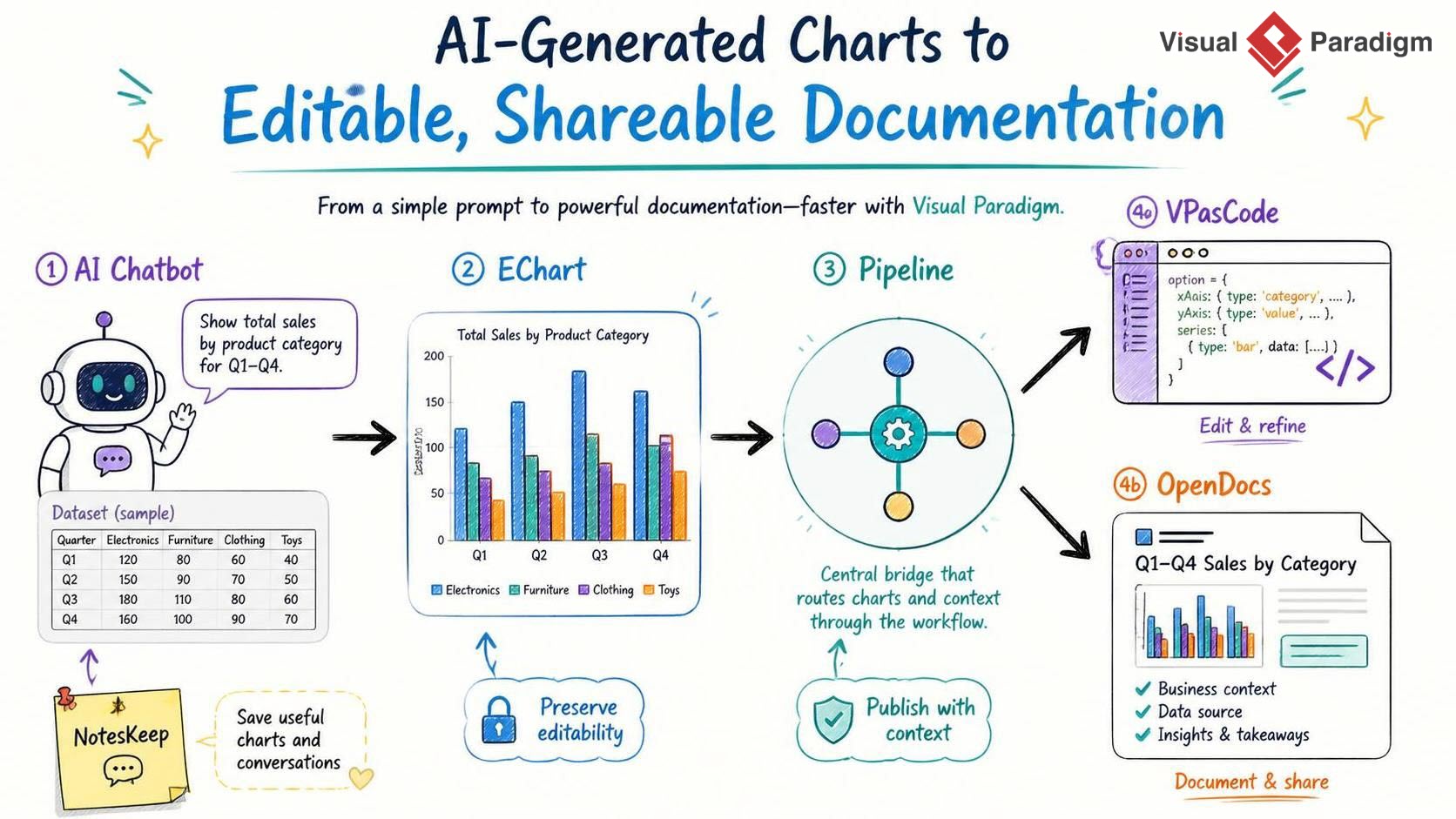
From an AI-Generated Chart to a Complete Working Process
Creating a chart often involves more than producing the first visual result. After generating a chart, users may need to adjust its content, refine its structure, explain its meaning, include it in a report or share it with colleagues.
Previously, these steps could require exporting a chart, downloading an image, copying content between applications or recreating the chart manually. With the new Pipeline integration, the generated chart can move directly into the next stage of work.
The workflow is simple:
- Ask the AI Diagramming Chatbot to generate an EChart from a natural-language prompt or dataset.
- Review the generated chart in the diagram viewer.
- Send the chart to Pipeline with a name.
- Import the chart into VPasCode for code-based editing, or insert it into OpenDocs for documentation and publishing.
This creates a smooth path from idea to visualization, from visualization to refinement, and from refinement to a shareable document.
What Is Pipeline?
Pipeline is a hub that connects the different applications and capabilities within the Visual Paradigm ecosystem. It helps users move useful content between tools without interrupting their workflow.
When an EChart is sent to Pipeline from the AI Diagramming Chatbot, it becomes available to other connected applications. The chart is no longer limited to the original chatbot conversation. It can be reused as an editable diagram-as-code artifact or as part of a structured document.
Pipeline is especially useful when a team wants to separate different stages of work:
- Use the AI chart generator to quickly create an initial visualization.
- Use VPasCode to adjust the chart code and fine-tune the output.
- Use OpenDocs to explain, publish and share the finished chart.
Example: Generate an Employee Headcount Chart with AI
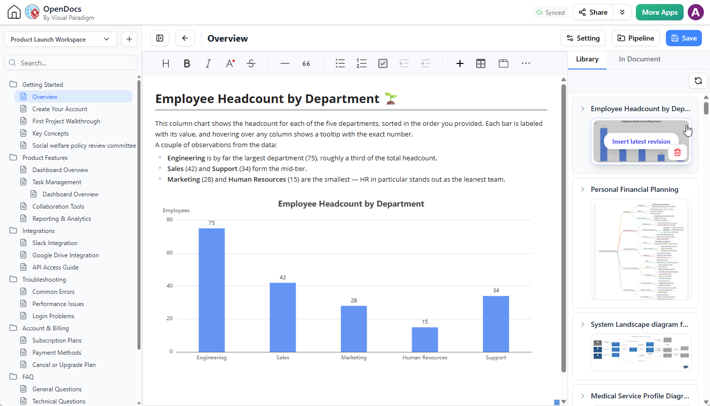
Suppose you want to visualize employee headcount by department. Instead of manually configuring a chart, you can ask the AI chart maker to create it from a simple prompt and dataset.
For example, enter the following request in the AI Diagramming Chatbot:
Generate a column chart showing employee headcount by department based on the dataset below.
Engineering: 75
Sales: 42
Marketing: 28
Human Resources: 15
Support: 34
The AI chart generator produces an EChart based on the information provided. You can then review the chart in the diagram viewer and send it to Pipeline for further use.
This approach is useful for many types of data visualization, including:
- Department headcount and workforce analysis
- Sales performance and revenue reporting
- Marketing campaign results
- Project progress and delivery metrics
- Budget allocation and cost analysis
- Customer support volume and response trends
- Product usage and business performance dashboards
How to Send an AI-Generated Chart to Pipeline
- Open the Visual Paradigm AI Diagramming Chatbot.
- Ask the AI to generate a chart. You can describe the chart type, provide a dataset or explain the information you want to visualize.
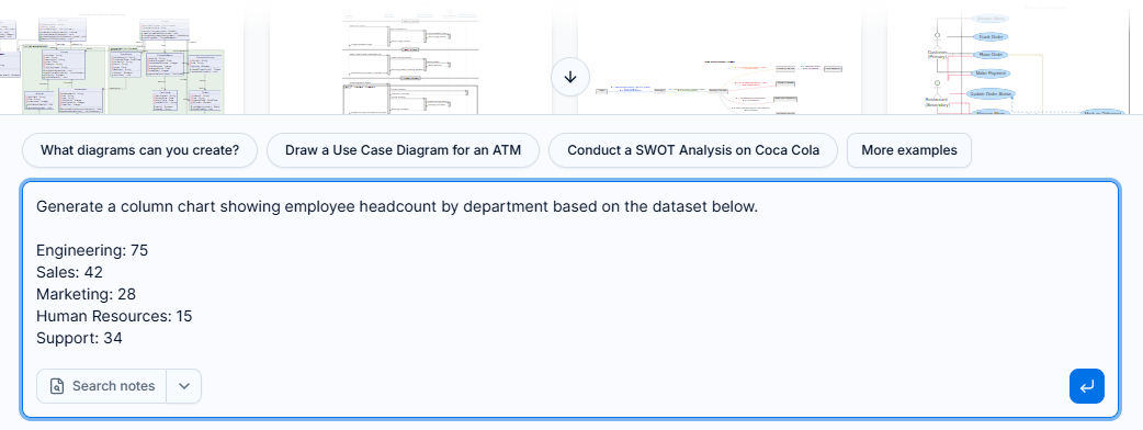
- Wait for the AI chart generator to produce the EChart.
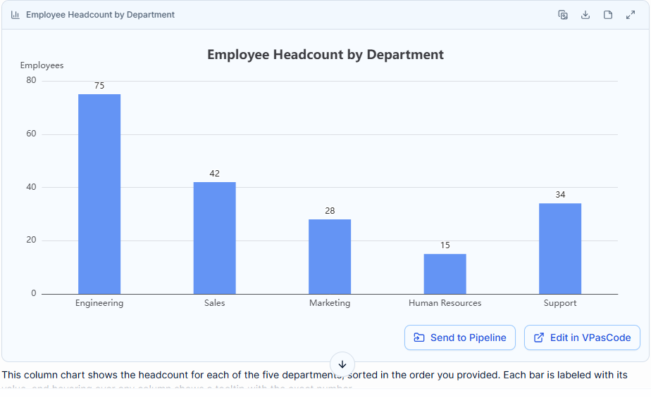
- Review the chart in the diagram viewer.
- At the bottom of the diagram viewer, click Send to Pipeline.

- Enter a name for the diagram, such as Employee Headcount by Department.
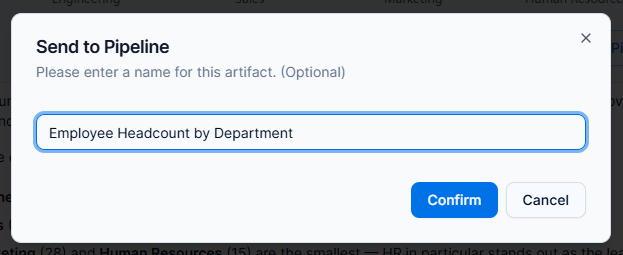
- Click Confirm.
The chart is then stored in Pipeline and can be accessed from supported Visual Paradigm applications.
Edit the Chart in VPasCode
AI-generated charts provide a fast starting point, but users may want precise control over chart content, labels, layout, colors or data. VPasCode provides a diagram-as-code environment where the chart can be edited and refined in a more controlled way.
To edit a chart generated by the AI chart maker in VPasCode:
- Open the VPasCode code editor.
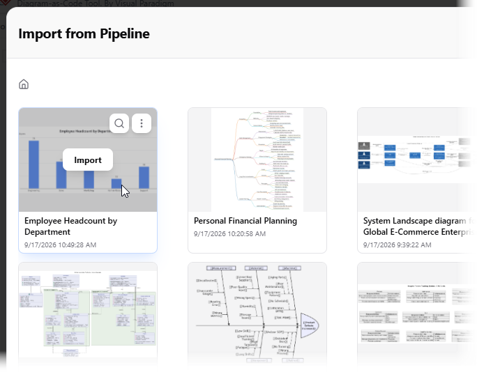
- Click Pipeline at the top of the page.

- Locate the chart sent from the AI Diagramming Chatbot.
- Click Import.
- Review the imported chart code in the editor.
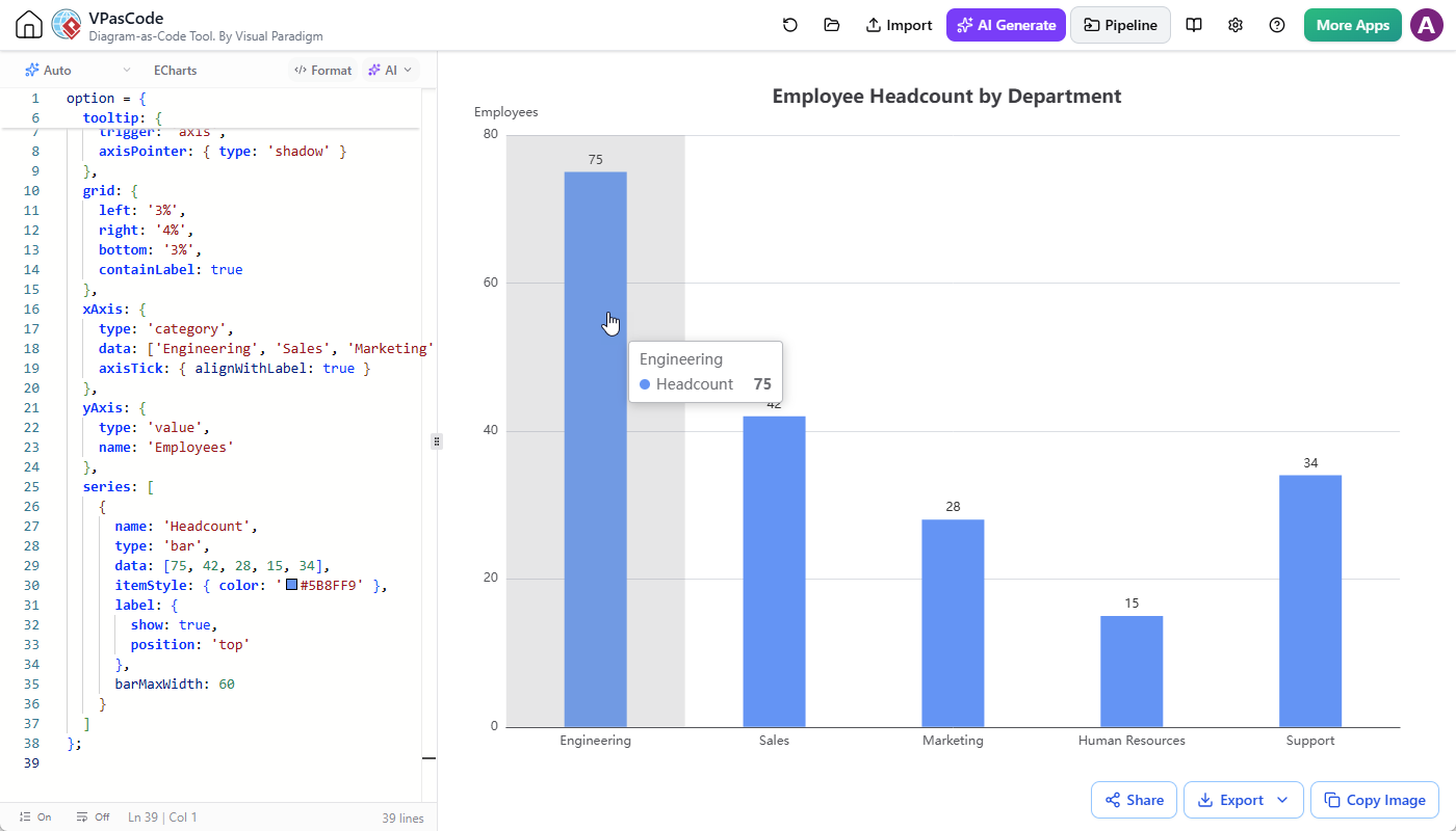
- Make the required changes and preview the updated chart.
With VPasCode, users can move from natural-language chart generation to code-level control. This is helpful when a chart needs to follow a specific presentation standard, use consistent naming, display additional data or match the visual language of an existing project.
After editing the chart in VPasCode, users can also send the updated work to Pipeline. This makes it possible to continue the workflow in OpenDocs and include the refined chart in a report or knowledge page.
Document and Share the Chart in OpenDocs
A chart becomes more useful when it is presented together with explanations, assumptions, conclusions and supporting information. OpenDocs allows users to place the chart in a document and turn the visualization into part of a complete information resource.
To insert a Pipeline chart into OpenDocs:
- Open Visual Paradigm OpenDocs.
- Create a new page or open an existing page.
- Click Edit at the top right corner of the page.

- Place the text cursor where you want to insert the chart.
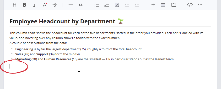
- Click the Pipeline button at the top right to open the Pipeline pane.
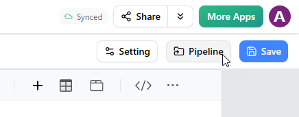
- Locate the chart you sent from the chatbot or edited in VPasCode.
- Click the chart to insert it into the page.
- Continue adding text, explanations, tables or other supporting content.
Once the page is ready, you can use OpenDocs to document the analysis, publish the page and share it with other people. This is useful for internal reports, project documentation, business reviews, technical references, research summaries and team knowledge bases.
Why This AI Chart Generator Enhancement Matters
The main value of this enhancement is not only that the chatbot can generate a chart. The greater benefit is that the chart can continue through a connected workflow after it has been created.
Reduce the gap between data and visualization
Users can describe what they want to see in natural language and provide the relevant data. The AI chart maker then creates an initial visualization without requiring the user to manually configure every chart element.
This makes chart creation more accessible to users who understand the business question or dataset but may not want to start with chart syntax or visualization code.
Move quickly from first draft to refined result
An AI-generated chart is often the beginning of the process rather than the final deliverable. Pipeline provides a direct transition from generation to refinement, while VPasCode gives users a dedicated place to adjust the chart as diagram-as-code.
This combination supports rapid experimentation without sacrificing control. Users can ask AI to produce a first version, then make targeted adjustments when precision matters.
Keep visualizations connected to documentation
A standalone chart may communicate a trend, but documentation provides the context needed to understand the trend. By sending the chart to OpenDocs, users can explain the data source, describe key findings, add recommendations and record decisions around the visualization.
The result is a more complete and reusable knowledge asset rather than an isolated image.
Support collaboration across roles
Different team members may contribute at different stages. A business user may describe the required chart, an analyst may validate the data, a technical user may refine the chart code, and a project manager may publish the result in a shared document.
The connection between the AI Diagramming Chatbot, Pipeline, VPasCode and OpenDocs helps these users work with the same chart throughout the process.
Improve operational efficiency
Moving content directly between connected tools reduces repetitive work such as downloading files, copying chart definitions, recreating visualizations or manually inserting exported images into documents.
By shortening these handoffs, the Visual Paradigm AI ecosystem helps users spend more time interpreting information and making decisions.
AI Chart Maker for More Than One-Off Visuals
The new workflow makes the AI Diagramming Chatbot useful for both quick visual exploration and structured deliverables.
For example, a team can use the AI chart generator to explore quarterly sales figures, send the resulting chart to Pipeline, refine the chart in VPasCode and insert the final version into an OpenDocs business review. The same workflow can be used for workforce planning, product analytics, project reporting or operational analysis.
Because the chart can move between applications, users are not forced to choose between convenience and editability. The chatbot provides speed, VPasCode provides precision and OpenDocs provides context and distribution.
Save Charts and Conversations to NotesKeep
In addition to Pipeline, the AI Diagramming Chatbot also provides a convenient way to preserve useful content in Visual Paradigm’s NotesKeep tool.
You can save:
- A generated chart
- The full chatbot conversation
- A selected section of the conversation
- Important explanations or analysis produced by the AI
To save a generated diagram, click the small Save to NotesKeep button at the top right of the diagram viewer. To save the conversation, use the NotesKeep option below the conversation. You can also select a specific portion of text and click the floating Send to NotesKeep button.
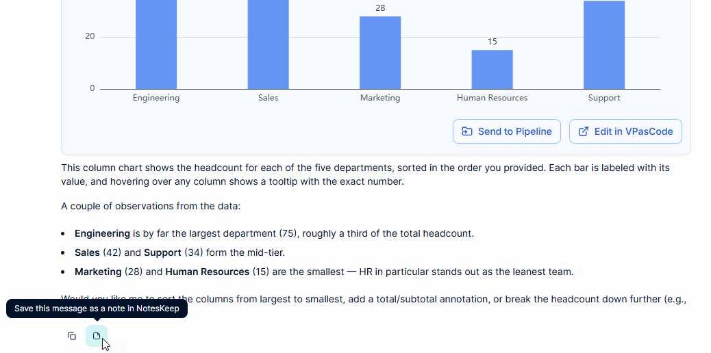
NotesKeep is separate from the Pipeline workflow, but it provides another way to preserve useful results from AI-assisted chart creation. It can help users build a searchable knowledge repository for future reference.
Suggested Prompts for the AI Chart Maker
You can use the AI chart generator with a variety of prompts. Here are several examples:
- Generate a bar chart comparing monthly revenue for the first half of the year.
- Create a pie chart showing the percentage distribution of the project budget.
- Generate a line chart showing website traffic over the past 12 months.
- Create a stacked column chart comparing product sales across regions.
- Generate a chart showing the number of support tickets by category and priority.
- Create a data visualization showing project completion percentage by team.
- Generate an EChart from the following dataset and use clear labels and a professional layout.
For better results, include the chart type, the data, the intended audience and any formatting preferences. You can also ask the AI to revise the chart after reviewing the first result.
A Connected Workflow for AI-Assisted Data Visualization
The enhanced workflow can be summarized as:
Describe → Generate → Refine → Document → Share
Describe the business question or dataset in the AI Diagramming Chatbot. Generate an EChart with the AI chart maker. Send the chart to Pipeline and refine it in VPasCode when necessary. Insert the chart into OpenDocs with supporting explanations. Finally, publish or share the completed page with your team.
This connected approach makes it easier to transform raw information into a useful visual explanation. It also helps organizations maintain a more consistent process for creating, editing and communicating data-driven content.
Try the Enhanced AI Chart Generator
Start creating charts from natural-language prompts with the Visual Paradigm AI Diagramming Chatbot.
When your chart is ready, send it to Pipeline and continue your work in:
- VPasCode for diagram-as-code editing and refinement
- OpenDocs for documentation, publishing and sharing
With the new EChart-to-Pipeline capability, Visual Paradigm brings AI chart generation, diagram editing and documentation closer together, helping users create better visual content with less manual effort.
Related posts:
 Seamless Diagram Lifecycle Management: Enhance and Edit AI-Generated Diagrams in Visual Paradigm OpenDocs via VPasCode
 Streamline Project Planning with the New AI Work Breakdown Structure Generator by Visual Paradigm
 Introduce Stepwise Flowcharts: AI-Powered Process Mapping
 Introducing Enhanced Data Flow Diagram (DFD) Generation with Intelligent Layouts