


Have you ever used an AI chart maker to build a visual, only to realize the data was slightly off or the colors didn’t match your brand?
While AI chart generation is incredibly powerful for brainstorming and getting a quick head start, static AI results often fall short when it’s time to present to your team or clients. In the real world, you need the flexibility to edit, refine, and update your data to match your exact scenario.
To help you tell the right story with your data, our chatbot-powered AI chart generator supports a wide variety of chart types, making it easier than ever to meet your diverse data visualization needs.
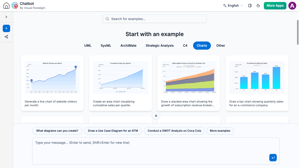
Explore More Chart Types for Any Scenario
Whether you need simple trends or advanced data maps, our AI chart generation tool can now create a massive variety of layouts directly from your text prompts, including:
-
Classic Formats: Line charts, Area charts, and Bar/Column charts (including stacked options).
-
Proportional Breakdown: Pie, Doughnut, Nightingale Rose, and Sunburst charts.
-
Performance & Tracking: Radar charts, Scatter plots, Funnel diagrams, and Gauge meters.
-
Advanced Flow & Trends: Sankey diagrams and Theme Rivers.
But we don’t stop at just generating them.
The Complete Workflow: Create with AI Chatbot, Edit with VPasCode
A truly useful AI chart maker shouldn’t just hand you a static picture and leave you stuck. With Visual Paradigm’s all-in-one ecosystem, you get a seamless, flexible AI chart generation workflow that gives you the best of both worlds:
-
Instant Ideation: Ask our AI Chatbot to generate the chart type you need to jumpstart your design.
-
Total Control: Instantly open the generated chart in Visual Paradigm VPasCode, our diagram-as-code editor. From there, you can freely edit the raw data, tweak the values, and fully customize the style—such as switching colors to match your brand—to make it entirely your own.
Instead of recreating charts from scratch just because a single number changed, our AI chart generator gives you the perfect starting point, and the exact tools you need to finish the job.
See It in Action
Ready to test our AI chart maker yourself? Open the AI Chatbot and start with a simple request:
Sample Prompt:
“Generate a bar chart for monthly website traffic”
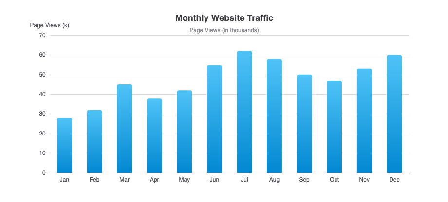
Chat session: https://ai-toolbox.visual-paradigm.com/app/chatbot-v2/share/b5e7983a-a3f5-4b3a-9b23-c01ba7d55831
Once the chatbot builds it, simply open the chart in the VPasCode editor to plug in your exact numbers and change the colors to match your design.
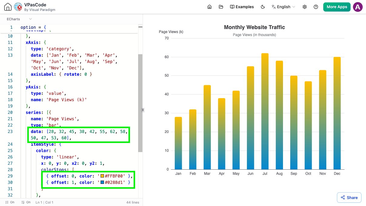
More Examples
Area Chart
Sample Prompt: “Generate an area chart visualizing cumulative sales per quarter“
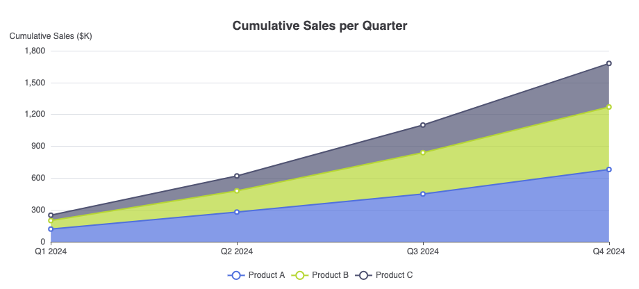
Chat session: https://ai-toolbox.visual-paradigm.com/app/chatbot-v2/share/e45ed6d5-c2e7-4987-8e00-a8118622ebf9
Line Chart
Sample Prompt: “Generate a line chart of website visitors per month“
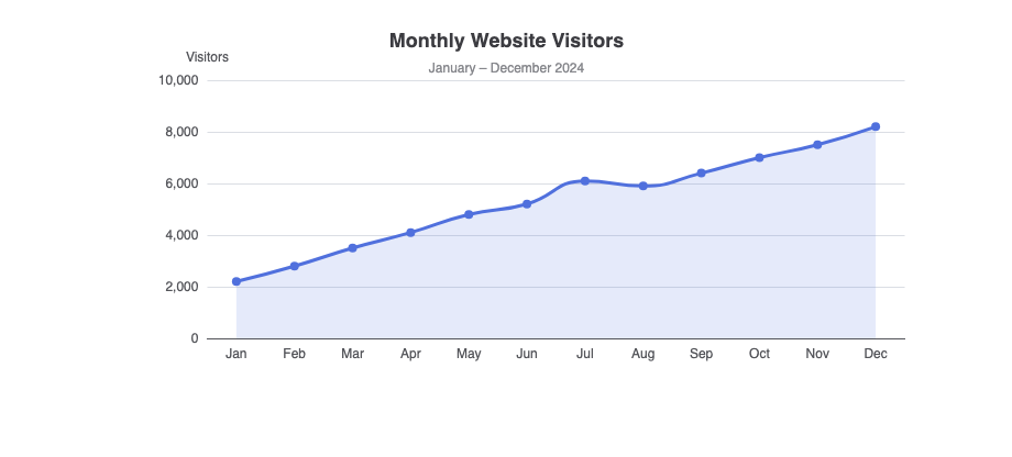
Chat session: https://ai-toolbox.visual-paradigm.com/app/chatbot-v2/share/e1ff3d1c-0599-437e-a53b-527aba2d7ee2
Pie Chart
Sample Prompt: “Create a pie chart showing market share of top 5 smartphone brands“
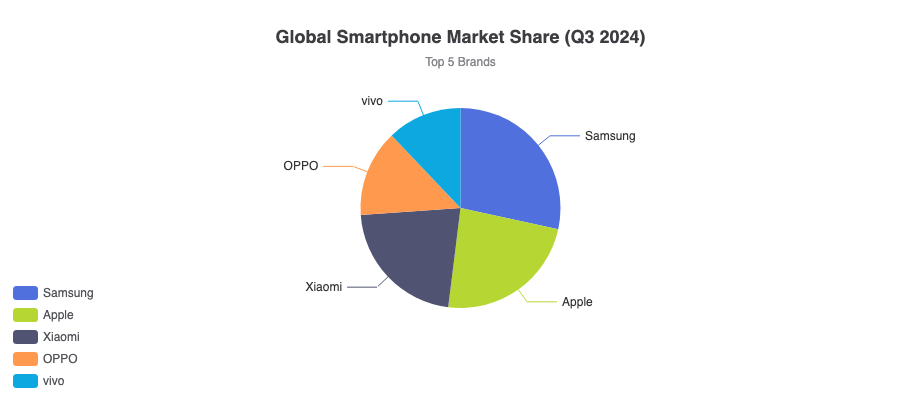
Chat session: https://ai-toolbox.visual-paradigm.com/app/chatbot-v2/share/75aab809-1f8d-4289-a6cc-c11371525aef
Doughnut Chart
Sample Prompt: “Generate a doughnut chart showing the percentage breakdown of a company’s expenses“
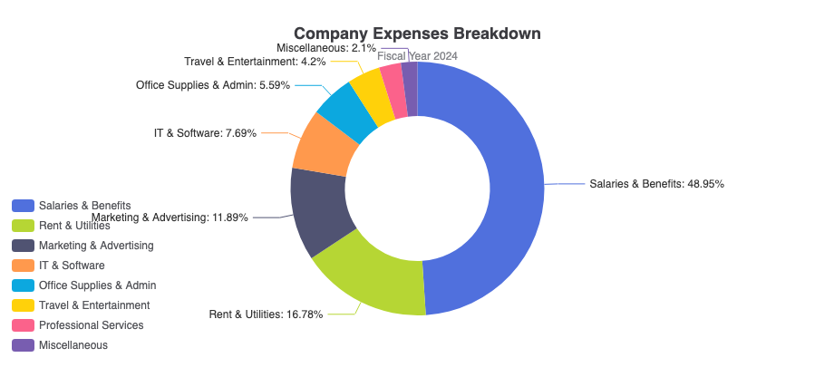
Chat session: https://ai-toolbox.visual-paradigm.com/app/chatbot-v2/share/d913f706-1472-4a7d-83b3-79b9e54efce0
Stacked Bar Chart
Sample Prompt: “Generate a stacked bar chart showing quarterly sales by region“
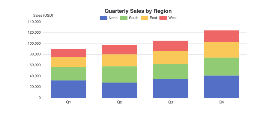
Chat session: https://ai-toolbox.visual-paradigm.com/app/chatbot-v2/share/ee6e06a9-0522-4c0a-9b4d-e2d499b7078e
Sankey Diagram
Sample Prompt: “Generate a Sankey diagram showing the flow of energy from primary sources to end-use“
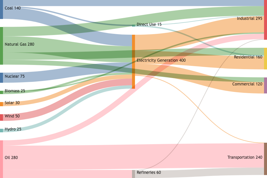
Chat session: https://ai-toolbox.visual-paradigm.com/app/chatbot-v2/share/3e5134d0-02db-4ec8-9375-646d97fa5bab
Sunburst Chart
Sample Prompt: “Generate a sunburst chart visualizing the hierarchical breakdown of website traffic, from traffic source channels down to specific landing pages.“
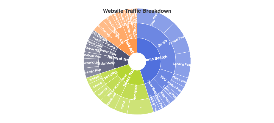
Chat session: https://ai-toolbox.visual-paradigm.com/app/chatbot-v2/share/3485e773-f1b3-46e8-9d42-37f5ffdb087f
Radar Chart
Sample Prompt: “Generate a radar chart showing employee skill levels in a team“
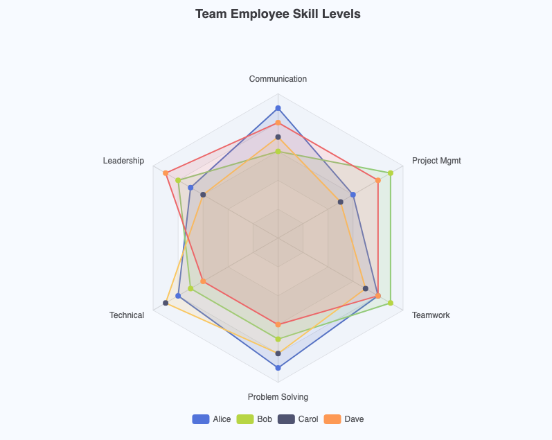
Chat session: https://ai-toolbox.visual-paradigm.com/app/chatbot-v2/share/ad7ae91f-3c41-420a-b710-d4485af1f736
Take Control of Your Data Visualization
Stop settling for rigid, uneditable AI images. Experience the power of a flexible AI chart maker that adapts to your actual business needs. Bring your ideas to life instantly with AI Chatbot chart generation, and freely edit the data and style using VPasCode.