


在 Visual Paradigm,我们始终致力于突破开发者、数据分析师和技术专业人士可视化复杂系统和数据集的界限。最近,我们推出了VPasCode,一个统一的文本转图表平台,旨在消除在多个绘图工具之间切换的摩擦。通过在单一集成开发环境中支持 Mermaid、PlantUML 和 Graphviz 等流行语法选项,VPasCode 已迅速成为快速、精准绘制图表的首选生态系统。
今天,我们非常激动地宣布,我们的工具包迎来了一次重大升级:VPasCode 现已原生支持 Apache ECharts。这一新增功能使我们的绘图环境转变为一个高度灵活、代码驱动的图表制作工具。现在,您可以将 JSON 配置或 AI 辅助的描述实时转换为丰富且交互式的数据可视化效果。
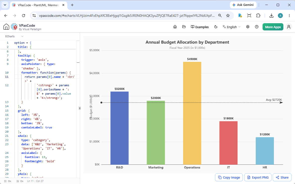
通过我们并排的界面,操作依然简单直观:在左侧面板输入您的 ECharts 配置对象,右侧面板将无缝渲染出您的交互式仪表板组件。
为什么选择 VPasCode 作为您的图表生成器?
与传统静态图表软件强制您拖拽、放置并手动调整每个像素不同,VPasCode 完全依赖结构化代码。集成 ECharts 为现代技术团队带来了显著优势:
- 统一架构:在同一个标签页内,轻松在应用架构蓝图(通过 PlantUML/Mermaid)和数据分析仪表板(通过 ECharts)之间切换。
- AI 驱动的工作流: 将我们的平台作为智能AI 图表生成器。在我们的 AI 绘图聊天机器人中直接描述您的数据需求,即可自动生成准确的可视化图表,无需手动样式调整。
- 高度可共享的状态:每个图表配置都会被压缩为一个唯一且可共享的 URL,使得在代码审查、维基文档或现场客户演示中协作变得极为简单。
探索 VPasCode 中 ECharts 的实时示例
为了展示我们更新后的图表生成器,我们准备了多个生产级别的数据可视化模板。您可以通过访问配套的沙盒链接,直接与每个示例进行交互。
1. 堆叠条形图(区域销售分析)
非常适合查看各组之间的绝对总数,同时分解各类别的分布情况。
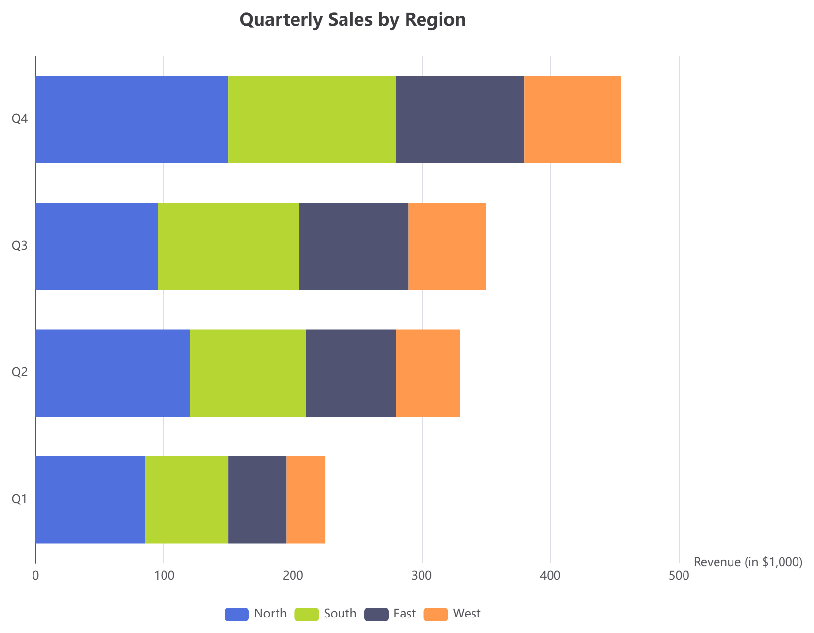
option = {
  title: { text: '按区域划分的季度销售额' },
  tooltip: { trigger: 'axis', axisPointer: { type: 'shadow' } },
  legend: { data: ['北部', '南部', '东部', '西部'] },
  xAxis: { type: 'value', name: '收入(单位:千美元)' },
  yAxis: { type: 'category', data: ['Q1', 'Q2', 'Q3', 'Q4'] },
  series: [
    { name: '北部', type: 'bar', stack: 'Total', data: [85, 120, 95, 150] },
    { name: '南部', type: 'bar', stack: 'Total', data: [65, 90, 110, 130] },
    { name: '东部',  type: 'bar', stack: 'Total', data: [45, 70, 85, 100] },
    { name: '西部',  type: 'bar', stack: 'Total', data: [30, 50, 60, 75] }
  ]
};2. 带阴影区域的折线图(月度网站增长)
专为追踪时间序列变化而设计,支持平滑插值和清晰的网格对齐。
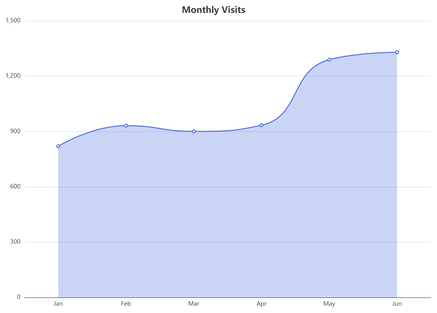
option = {
  title: { text: '月访问量', left: 'center' },
  tooltip: { trigger: 'axis' },
  grid: { left: 40, right: 20, top: 50, bottom: 30, containLabel: true },
  xAxis: { type: 'category', data: ['一月','二月','三月','四月','五月','六月'] },
  yAxis: { type: 'value' },
  series: [{
    name: '访问量',
    type: 'line',
    smooth: true,
    data: [820, 932, 901, 934, 1290, 1330],
    areaStyle: { opacity: 0.3 }
  }]
};3. 自定义面积图(明亮高光)
一个绝佳的样式灵活性展示,可即时调整线条颜色、边界配置和填充不透明度。
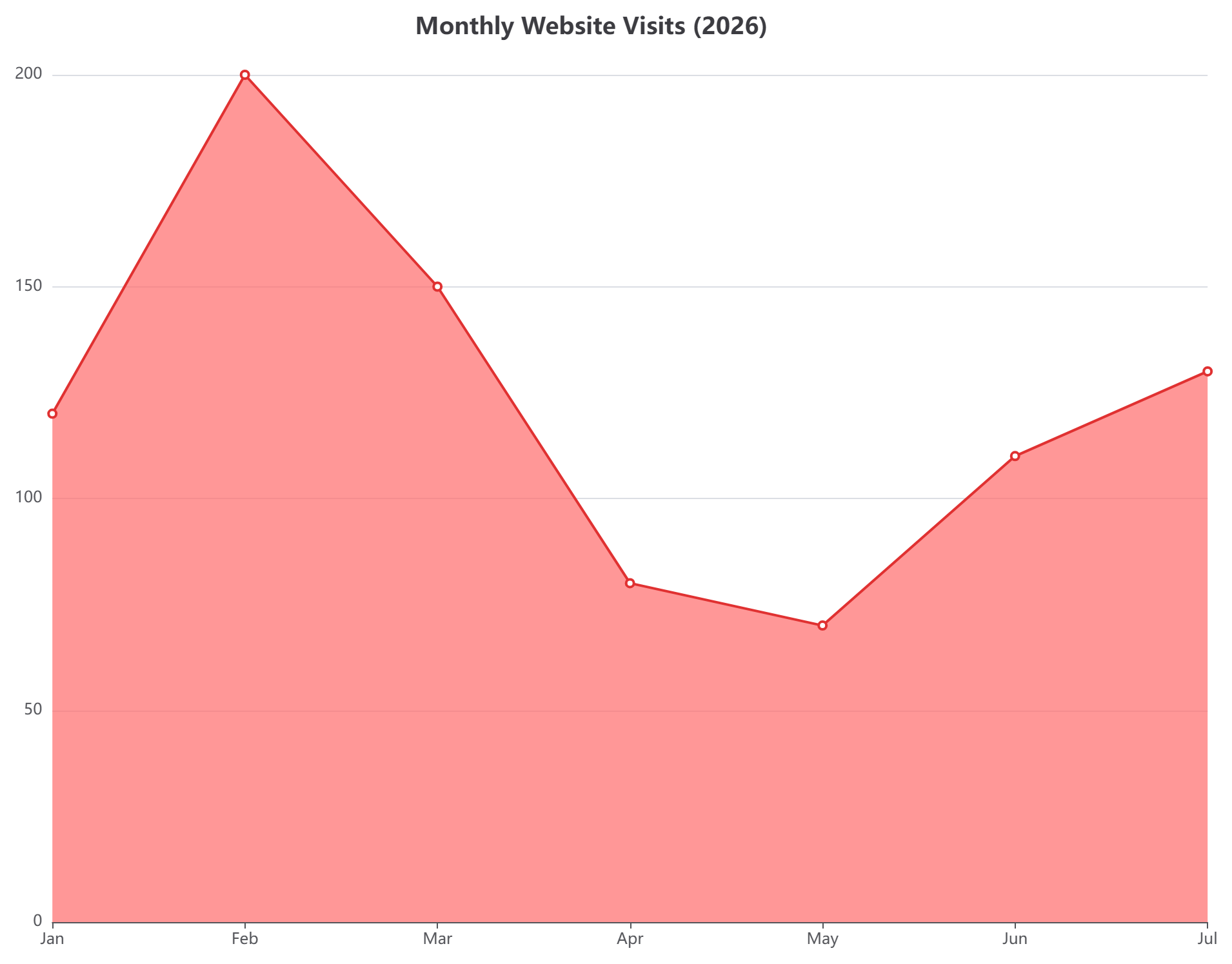
option = {
  title: { text: '2026 年月度网站访问量' },
  xAxis: { type: 'category', boundaryGap: false, data: ['一月', '二月', '三月', '四月', '五月', '六月', '七月'] },
  yAxis: { type: 'value' },
  series: [{
    data: [120, 200, 150, 80, 70, 110, 130],
    type: 'line',
    areaStyle: { color: '#ff6b6b' },
    lineStyle: { color: '#e03131' },
    itemStyle: { color: '#e03131' }
  }]
};4. 交互式饼图(流量来源构成)
一种经典布局,用于计算相对市场份额或流量来源,配有简洁的底部图例容器。
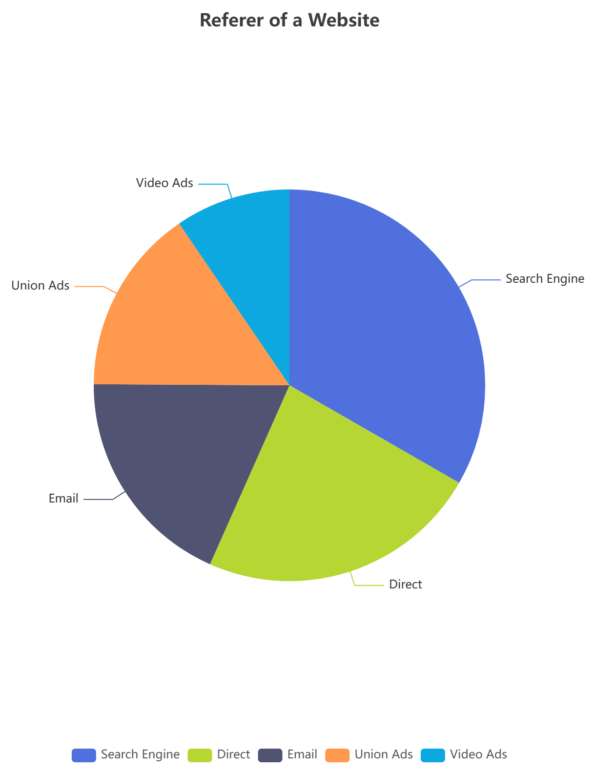
option = {
  title: { text: '网站来源引用', left: 'center' },
  tooltip: { trigger: 'item' },
  legend: { bottom: 10 },
  series: [
    {
      name: '访问来源',
      type: 'pie',
      radius: '50%',
      data: [
        { value: 1048, name: '搜索引擎' },
        { value: 735, name: '直接访问' },
        { value: 580, name: '电子邮件' },
        { value: 484, name: '联盟广告' },
        { value: 300, name: '视频广告' }
      ]
    }
  ]
};5. 雷达图(服务网格架构对比)
一种多变量图结构,常用于并列评估技术能力、软件基准或复杂架构标准。
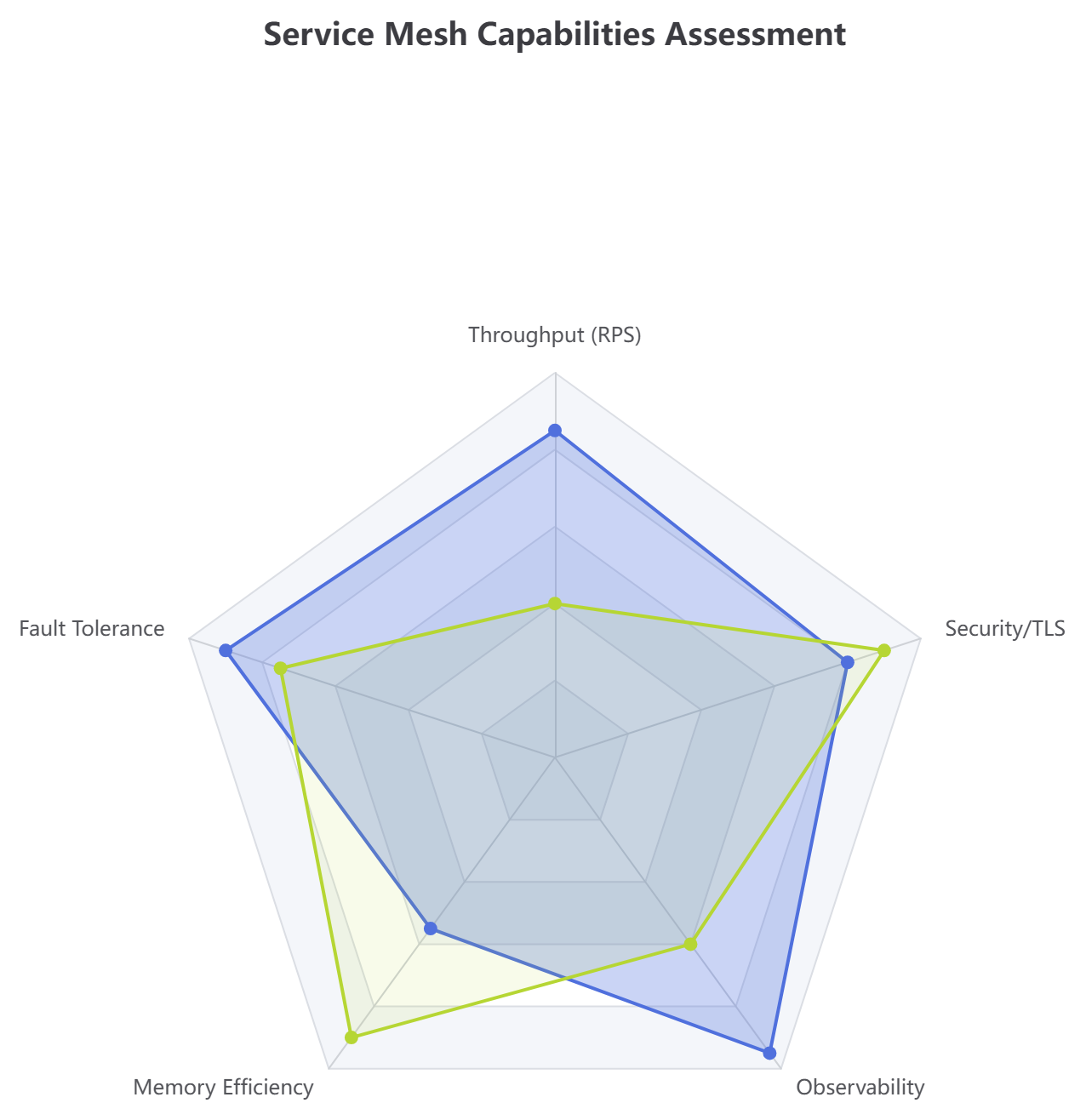
option = {
  title: { text: '服务网格能力评估' },
  tooltip: {},
  radar: {
    indicator: [
      { name: '吞吐量(RPS)', max: 100 },
      { name: '容错能力', max: 100 },
      { name: '内存效率', max: 100 },
      { name: '可观测性', max: 100 },
      { name: '安全性/TLS', max: 100 }
    ]
  },
  series: [{
    name: '服务配置文件',
    type: 'radar',
    data: [
      { value: [85, 90, 55, 95, 80], name: 'Go 代理节点', areaStyle: { opacity: 0.3 } },
      { value: [40, 75, 90, 60, 90], name: '旧版 Java 网关', areaStyle: { opacity: 0.1 } }
    ]
  }]
};6. 散点图(推理延迟指标分析)
非常适合识别异常峰值、负载大小阈值以及分布式基础设施中的应用瓶颈。
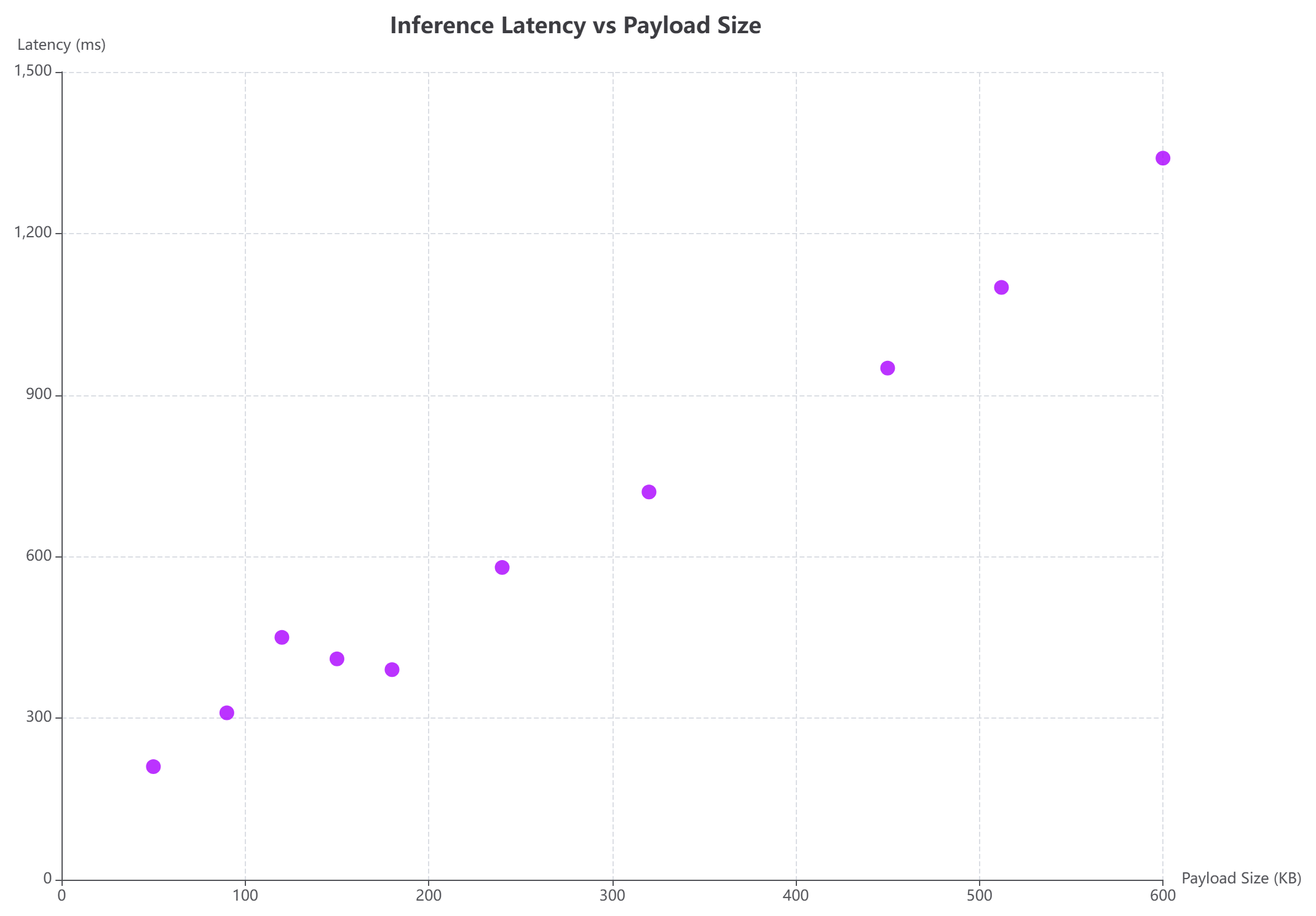
option = {
  title: { text: '推理延迟 vs 负载大小', left: 'center' },
  tooltip: { trigger: 'item', formatter: function (p) { return '大小: ' + p.value[0] + ' KB<br />延迟: ' + p.value[1] + ' 毫秒'; } },
  xAxis: { name: '负载大小(KB)', type: 'value', splitLine: { lineStyle: { type: 'dashed' } } },
  yAxis: { name: '延迟(毫秒)', type: 'value', splitLine: { lineStyle: { type: 'dashed' } } },
  series: [{
    type: 'scatter',
    symbolSize: 12,
    data: [
      [120, 450], [240, 580], [50, 210], [512, 1100], [320, 720],
      [180, 390], [450, 950], [90, 310], [600, 1340], [150, 410]
    ],
    itemStyle: { color: '#aa00ff' }
  }]
};7. 雷达图(多层级代码库许可)
使用同心环可视化层级关系。我们的平台充当有机的图表制作工具以简化此类复杂的嵌套数据配置。
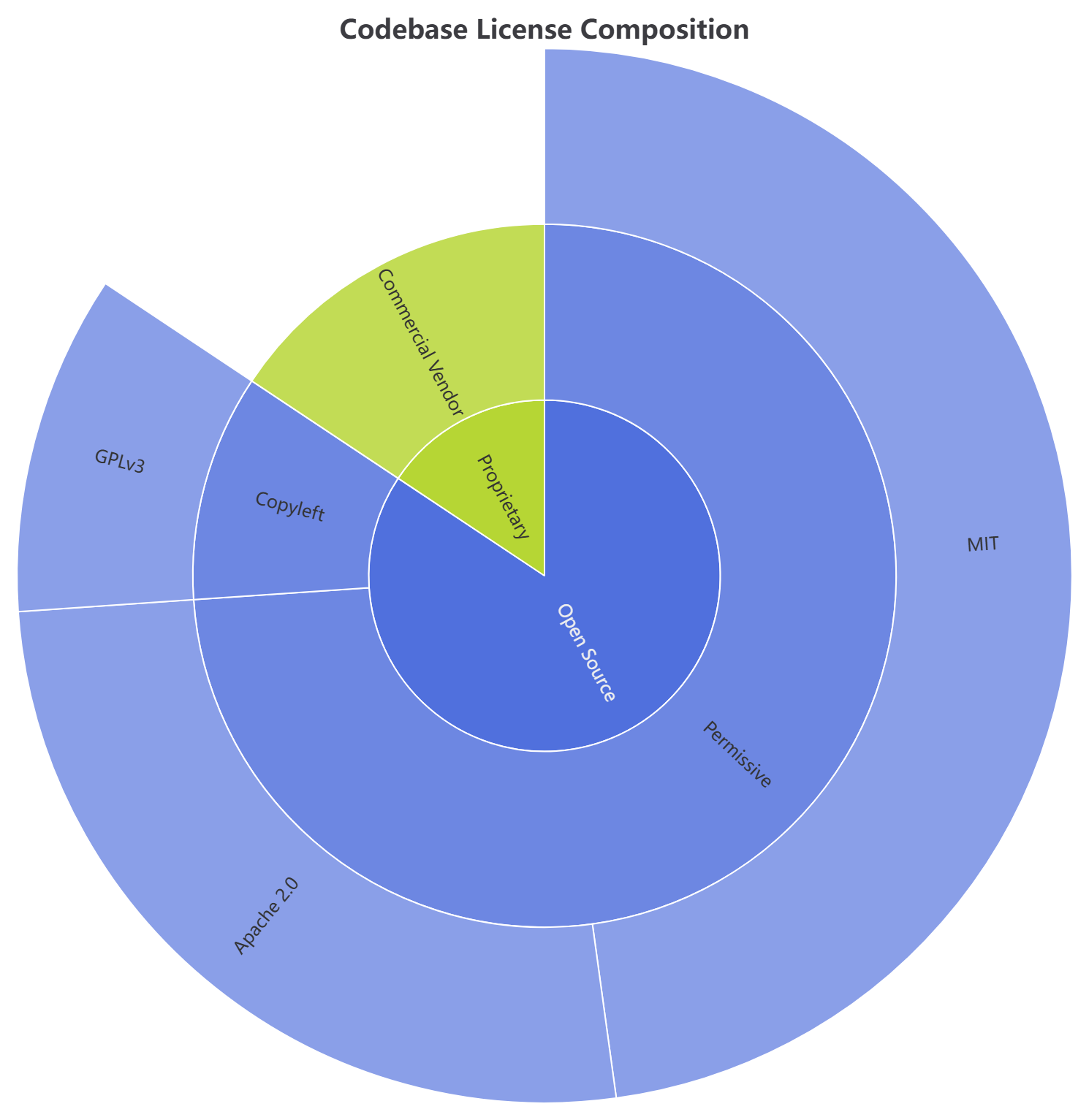
option = {
  title: { text: '代码库许可构成', left: 'center' },
  series: [{
    type: 'sunburst',
    radius: [0, '90%'],
    data: [{
      name: '开源',
      children: [
        { name: '宽松许可', children: [{ name: 'MIT', value: 55 }, { name: 'Apache 2.0', value: 30 }] },
        { name: '著佐许可', children: [{ name: 'GPLv3', value: 12 }] }
      ]
    }, {
      name: '专有',
      children: [{ name: '商业供应商', value: 18 }]
    }]
  }]
};8. 桑基图(基础设施成本流分析器)
通过流动的节点权重链接,追踪计算步骤中的操作资源映射或财务变量。
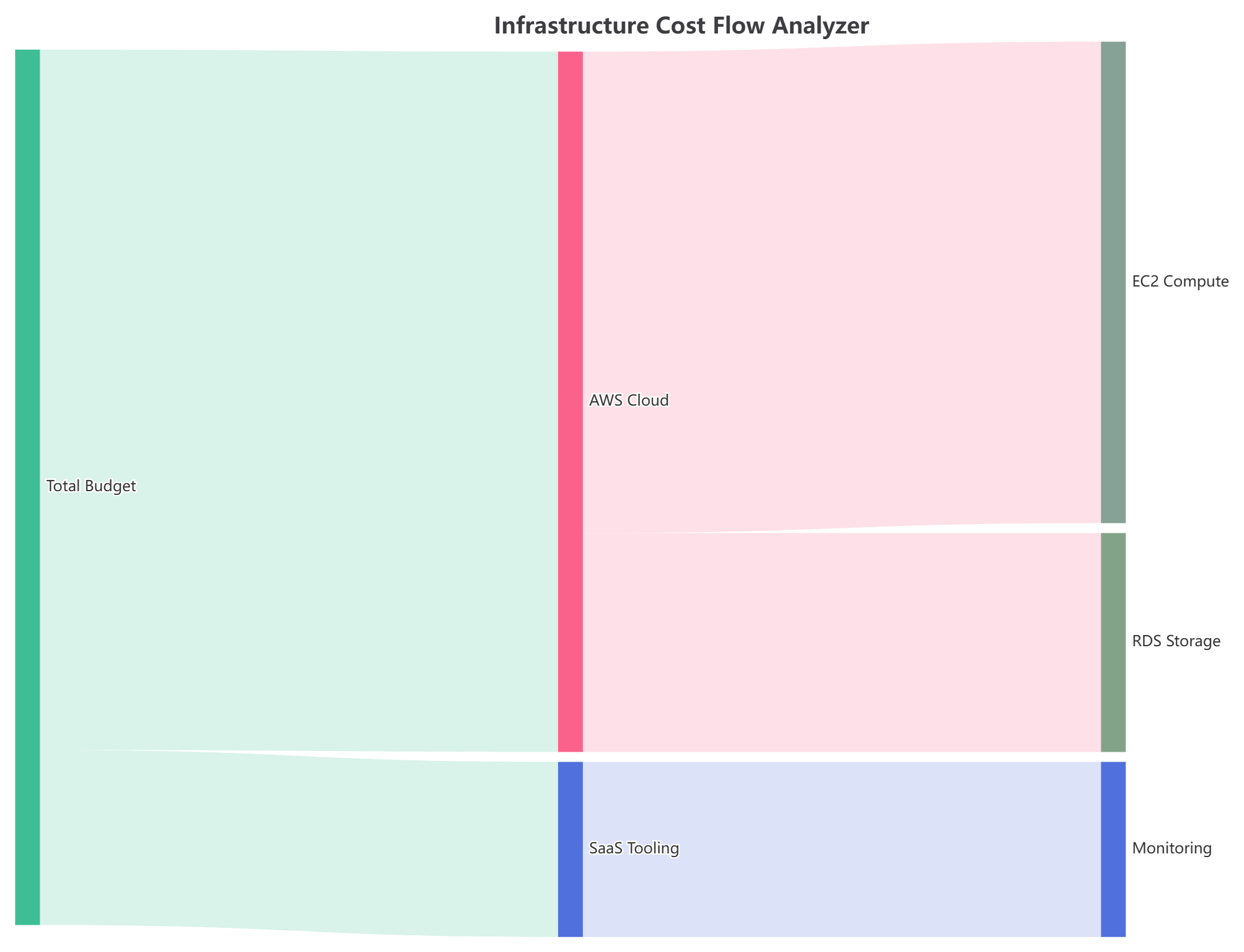
option = {
  title: { text: '基础设施成本流分析器' },
  tooltip: { trigger: 'item', triggerOn: 'mousemove' },
  series: [{
    type: 'sankey',
    data: [
      { name: '总预算' }, { name: 'AWS 云' }, { name: 'SaaS 工具' },
      { name: 'EC2 计算' }, { name: 'RDS 存储' }, { name: '监控' }
    ],
    links: [
      { source: '总预算', target: 'AWS 云', value: 8000 },
      { source: '总预算', target: 'SaaS 工具', value: 2000 },
      { source: 'AWS 云', target: 'EC2 计算', value: 5500 },
      { source: 'AWS 云', target: 'RDS 存储', value: 2500 },
      { source: 'SaaS 工具', target: '监控', value: 2000 }
    ],
    lineStyle: { color: 'source', curveness: 0.5 }
  }]
};9. 热力图(每小时部署速度网格)
轻松监控系统密度、部署量或自定义时间矩阵中的持续流量变化。
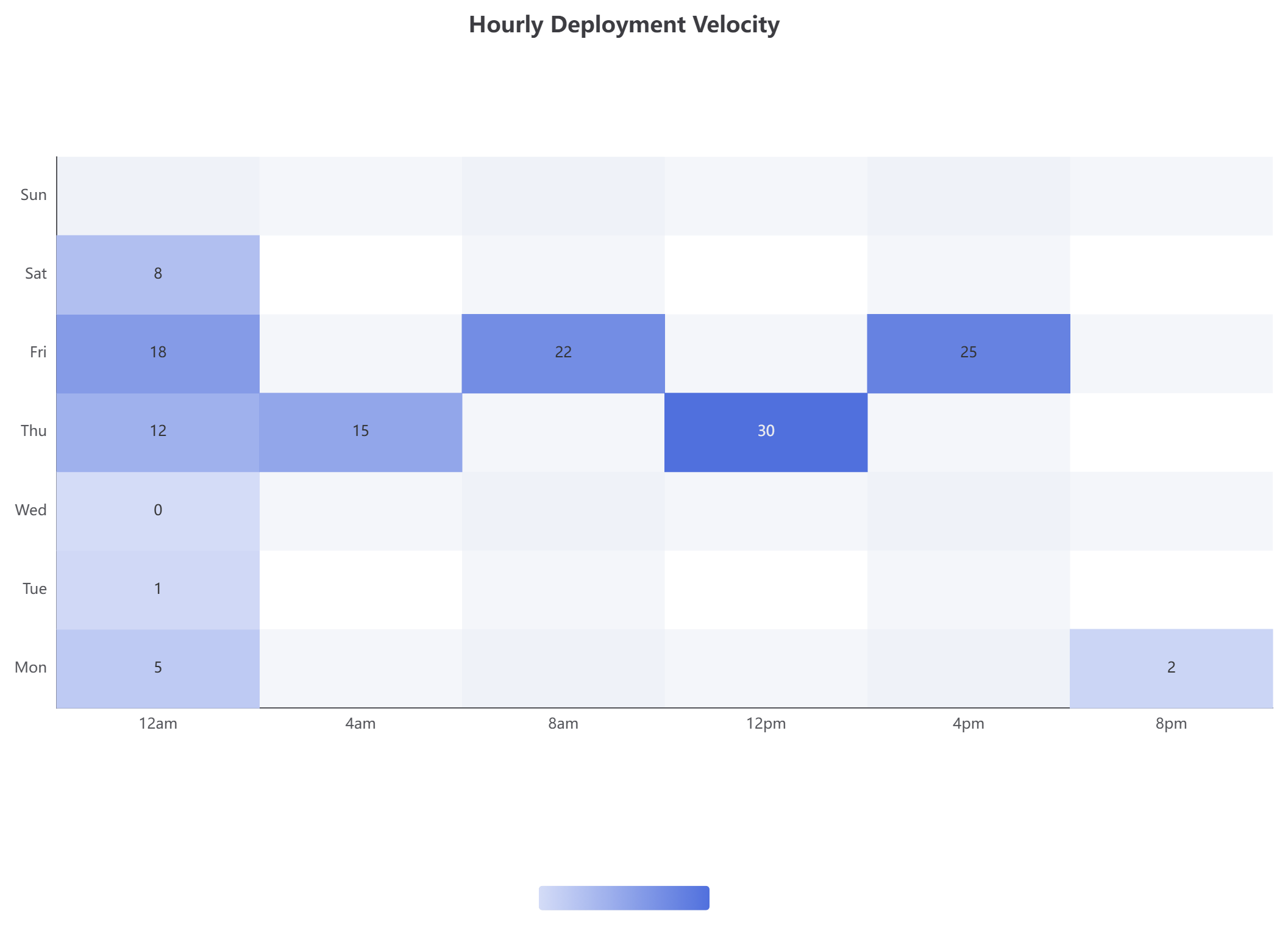
option = {
  title: { text: '每小时部署速度', left: 'center' },
  tooltip: { position: 'top' },
  grid: { height: '50%', top: '15%' },
  xAxis: { type: 'category', data: ['12点', '4点', '8点', '12点', '4点', '8点'], splitArea: { show: true } },
  yAxis: { type: 'category', data: ['周一', '周二', '周三', '周四', '周五', '周六', '周日'], splitArea: { show: true } },
  visualMap: { min: 0, max: 30, type: 'continuous', orient: 'horizontal', left: 'center', bottom: '15%' },
  series: [{
    name: '部署次数',
    type: 'heatmap',
    data: [[0,0,5],[0,1,1],[0,2,0],[0,3,12],[0,4,18],[0,5,8],[1,3,15],[2,4,22],[3,3,30],[4,4,25],[5,0,2],[6,0,1]],
    label: { show: true },
    emphasis: { itemStyle: { shadowBlur: 10, shadowColor: 'rgba(0, 0, 0, 0.5)' } }
  }]
};立即解锁文本转图表自动化的强大功能
无论您需要一个图表制作工具来转换原始业务指标,或需要一个用于结构工程地图的集中式画布,VPasCode 都能简化您的日常流程。告别碎片化的应用程序和脆弱的可视化库。
准备好将您的数据结构转化为交互式可视化仪表板了吗?
探索完整画布,试用这些模板,并免费测试我们的渲染性能。
立即启动实时 VPasCode 编辑器 →