


At Visual Paradigm, we are constantly pushing the boundaries of what is possible with automated, AI-driven software development tools. Following our massive Next-Gen AI Diagramming Chatbot V2 upgrade last week, we are thrilled to announce a major breakthrough in how our AI constructs complex system architectures: a completely redesigned, industry-leading Data Flow Diagram (DFD) generation engine.
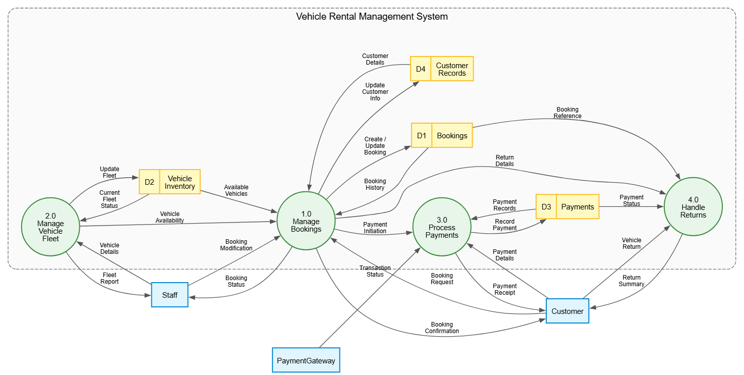
(Chat session: https://ai-toolbox.visual-paradigm.com/app/chatbot-v2/share/f1a24b22-777b-4cb5-b952-d519116e50ef )
Data Flow Diagrams are essential for mapping out how information moves through an application, tracking everything from external inputs to internal data storage. However, as systems grow, automated diagrams can quickly turn into a tangled “spaghetti” of crossing lines and ambiguous shapes. Our latest enhancement directly solves this problem, elevating the quality, readability, and professional look of every AI-generated DFD instantly.
What Makes the New AI DFD Generation Better?
While our previous AI engine generated accurate data flows, our new engine introduces sophisticated structural rendering rules that mimic the layout design of an expert systems analyst. We achieved this by completely rewriting the backend rendering pipelines to tap into advanced Graphviz modeling rules. Here are the three pillars of this upgrade:
1. Distinct Geometric Symbols for Precision Modeling
A great DFD should tell a story at a glance. In this update, the AI Chatbot applies sharp, color-coded, and unmistakable shape paradigms to eliminate all visual ambiguity:
- External Entities (Actors/Systems): Represented as crisp, light-blue rectangular boxes, making it instantly clear who or what is interacting with your application from the outside.
- Processes (Actions/Functions): Rendered as perfect green circles with clear numerical tracking (e.g., “1.0 Search Flights”), standardizing how operations are mapped.
- Data Stores (Databases/Files): Modeled as yellow record-style tables complete with internal IDs (e.g., “D1 | Flight Schedule”), perfectly mimicking classic Gane-Sarson or Yourdon & Coad notations.
2. Smart Routing Connectors to Eliminate Overlap
One of the biggest pain points in automated diagramming is crossing lines. If two data flows overlap, the diagram becomes difficult to interpret. Our new version utilizes an optimized splines = true and overlap = false matrix routing approach. Connectors now dynamically curve around processes and data stores, establishing clear, frictionless data paths that keep text labels legible and flows distinct.
3. Visual System Boundary Containers (Scope Mapping)
Understanding what lives inside your software system versus what remains external is vital for security and project scoping. The AI Diagramming Chatbot now automatically encapsulates all internal processes and data stores within a styled, dashed System Boundary Container. This logical grouping provides immediate context regarding system scope, a feature highly coveted by enterprise architects and software engineers alike.
See It in Action: The Graphviz Powering Your Diagrams
To demonstrate the depth of this enhancement, here is the clean, structurally structured Graphviz code generated by our AI Chatbot using the prompt: “Generate a Data Flow Diagram for an Airline Ticket Reservation System”.
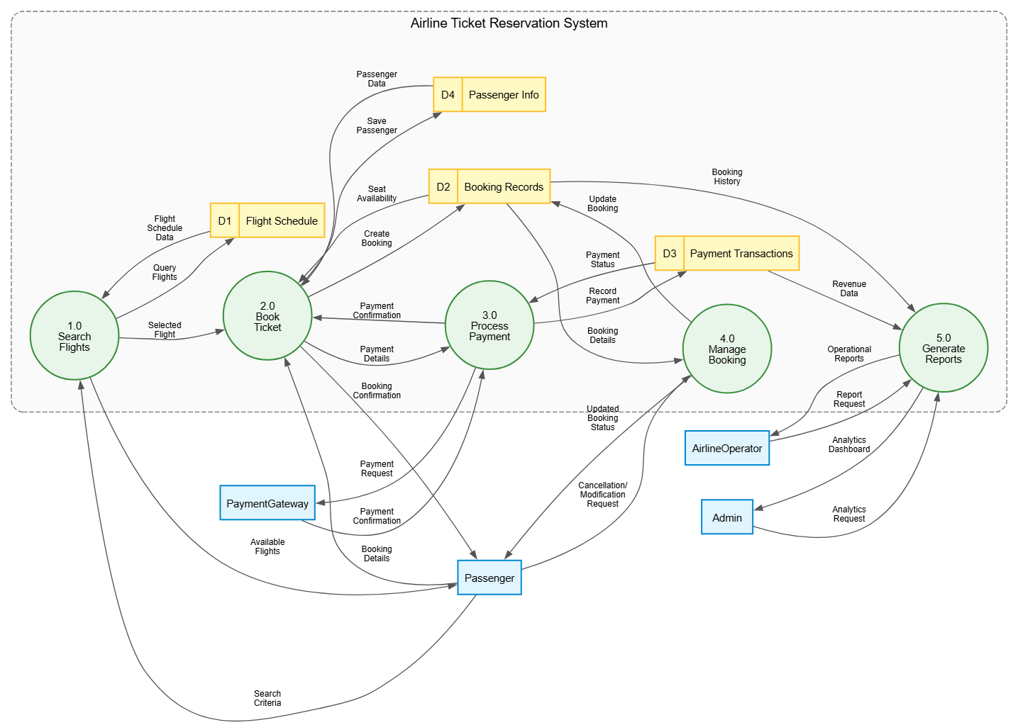
digraph DFD {
    // --- GRAPH STYLE ---
    graph [
        rankdir = LR
        splines = true
        overlap = false
        nodesep = 0.5
        ranksep = 0.8
        fontname = "Helvetica,Arial,sans-serif"
        fontsize = 12
    ]

    // --- NODE STYLES ---
    node [
        fontname = "Helvetica,Arial,sans-serif"
        fontsize = 11
        penwidth = 1.5
    ]

    // External Entities
    node [shape = box, style = "filled", fillcolor = "#E1F5FE", color = "#0288D1"]
    Passenger; AirlineOperator; PaymentGateway; Admin;

    // --- SYSTEM BOUNDARY CONTAINER ---
    subgraph cluster_SystemBoundary {
        label = "Airline Ticket Reservation System";
        fontname = "Helvetica,Arial,sans-serif"
        fontsize = 14
        color = "#757575"
        style = "dashed,rounded"
        bgcolor = "#FAFAFA"
        margin = 20

        // Processes
        node [shape = circle, style = "filled", fillcolor = "#E8F5E9", color = "#388E3C", fixedsize = true, width = 1.3]
        P1 [label="1.0\nSearch\nFlights"];
        P2 [label="2.0\nBook\nTicket"];
        P3 [label="3.0\nProcess\nPayment"];
        P4 [label="4.0\nManage\nBooking"];
        P5 [label="5.0\nGenerate\nReports"];

        // Data Stores
        node [shape = record, style = "filled", fillcolor = "#FFF9C4", color = "#FBC02D", fixedsize = false]
        FlightDS [label="{ <id> D1 | Flight Schedule }"];
        BookingDS [label="{ <id> D2 | Booking Records }"];
        PaymentDS [label="{ <id> D3 | Payment Transactions }"];
        PassengerDS [label="{ <id> D4 | Passenger Info }"];
    }

    // --- EDGE STYLES ---
    edge [
        fontname = "Helvetica,Arial,sans-serif"
        fontsize = 9
        color = "#555555"
        arrowsize = 0.8
    ]

    // --- DATA FLOWS ---
    Passenger -> P1 [label="Search\nCriteria"];
    Passenger -> P2 [label="Booking\nDetails"];
    Passenger -> P4 [label="Cancellation/\nModification\nRequest"];
    AirlineOperator -> P5 [label="Report\nRequest"];
    Admin -> P5 [label="Analytics\nRequest"];

    P1 -> Passenger [label="Available\nFlights"];
    P2 -> Passenger [label="Booking\nConfirmation"];
    P4 -> Passenger [label="Updated\nBooking\nStatus"];
    P3 -> PaymentGateway [label="Payment\nRequest"];
    PaymentGateway -> P3 [label="Payment\nConfirmation"];
    P5 -> AirlineOperator [label="Operational\nReports"];
    P5 -> Admin [label="Analytics\nDashboard"];

    P1 -> FlightDS [label="Query\nFlights"];
    P2 -> BookingDS [label="Create\nBooking"];
    P2 -> PassengerDS [label="Save\nPassenger"];
    P3 -> PaymentDS [label="Record\nPayment"];
    P4 -> BookingDS [label="Update\nBooking"];

    FlightDS -> P1 [label="Flight\nSchedule\nData"];
    BookingDS -> P2 [label="Seat\nAvailability"];
    BookingDS -> P4 [label="Booking\nDetails"];
    PassengerDS -> P2 [label="Passenger\nData"];
    PaymentDS -> P3 [label="Payment\nStatus"];
    BookingDS -> P5 [label="Booking\nHistory"];
    PaymentDS -> P5 [label="Revenue\nData"];

    P1 -> P2 [label="Selected\nFlight"];
    P2 -> P3 [label="Payment\nDetails"];
    P3 -> P2 [label="Payment\nConfirmation"];
}Seamless Integration with VPasCode: Edit Diagrams Instantly
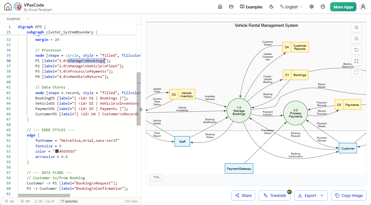
What good is an AI-generated diagram if you can’t customize it? Thanks to our native integration with Visual Paradigm’s VPasCode, our premium Diagram-as-Code platform, you retain complete creative control.
When you generate a Data Flow Diagram inside the AI chatbot, a button reading “Open in VPasCode” will appear directly underneath the diagram viewer.

Clicking this button seamlessly opens your diagram code inside the VPasCode workspace. From there, you can:
- Modify processes, add external actors, or adjust data streams using straightforward Graphviz syntax.
- See your modifications update in real-time right alongside your code editor.
- Instantly export your final custom layout to crisp, high-resolution formats like PNG, JPEG, or scalable vectors for documentation.
Ready to Generate Your Enhanced DFD?
Experience the precision of our enhanced Data Flow Diagram layout logic right now. Use the link below to load up the chatbot app and generate professional architecture maps within seconds.